worm
by J. C. McCrae
five volumes
casebound with jacket
one color
6 × 9 in.
1.68 million words
published 2021
gestation
640 pages
infestation
752 pages
colony
800 pages
chrysalis
736 pages
extinction
800 pages
about the book
Worm is an epic-length story released as a web serial in twice-weekly installments between 2011 and 2013. Never since edited or published, I created personal copies for myself as a long-time fan.
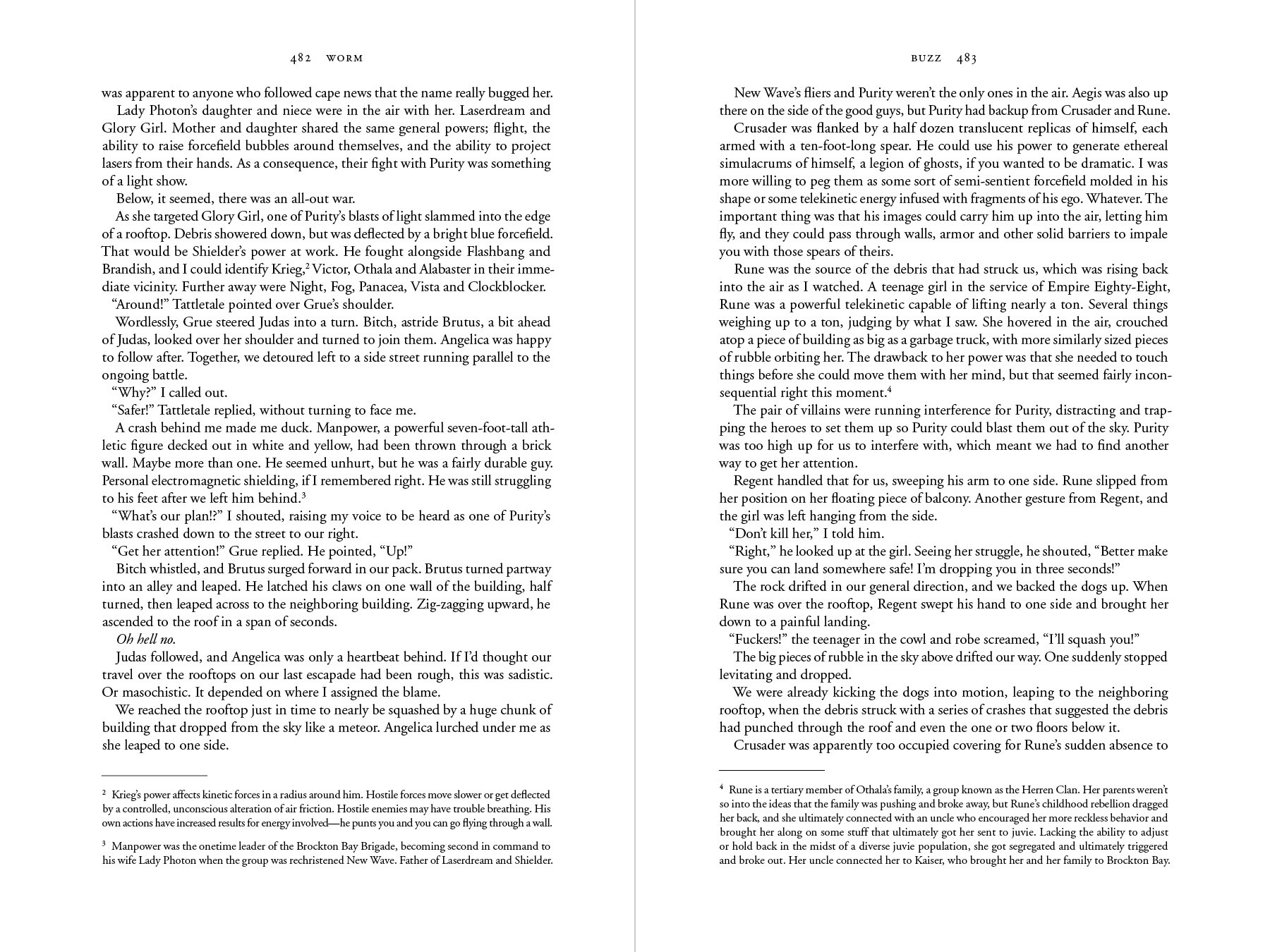
The primary challenge was managing the story’s length, with an 800 page-per-volume limit. It consists of 31 arcs, which I divided into five volumes. I used 10-pt Garamond for the body type, due to its space efficiency. Further challenges included proofing the text for typos and inconsistencies, and the organization / distribution of over 125 annotations.
This adaptation has received significant praise within the fandom, despite never being distributed.
Retrospective: I learned a great deal while designing these and in the time since. Looking back, I think the formatting of the footnotes could've been handled with more grace, and would like to have tried something more exciting with the chapter headings.
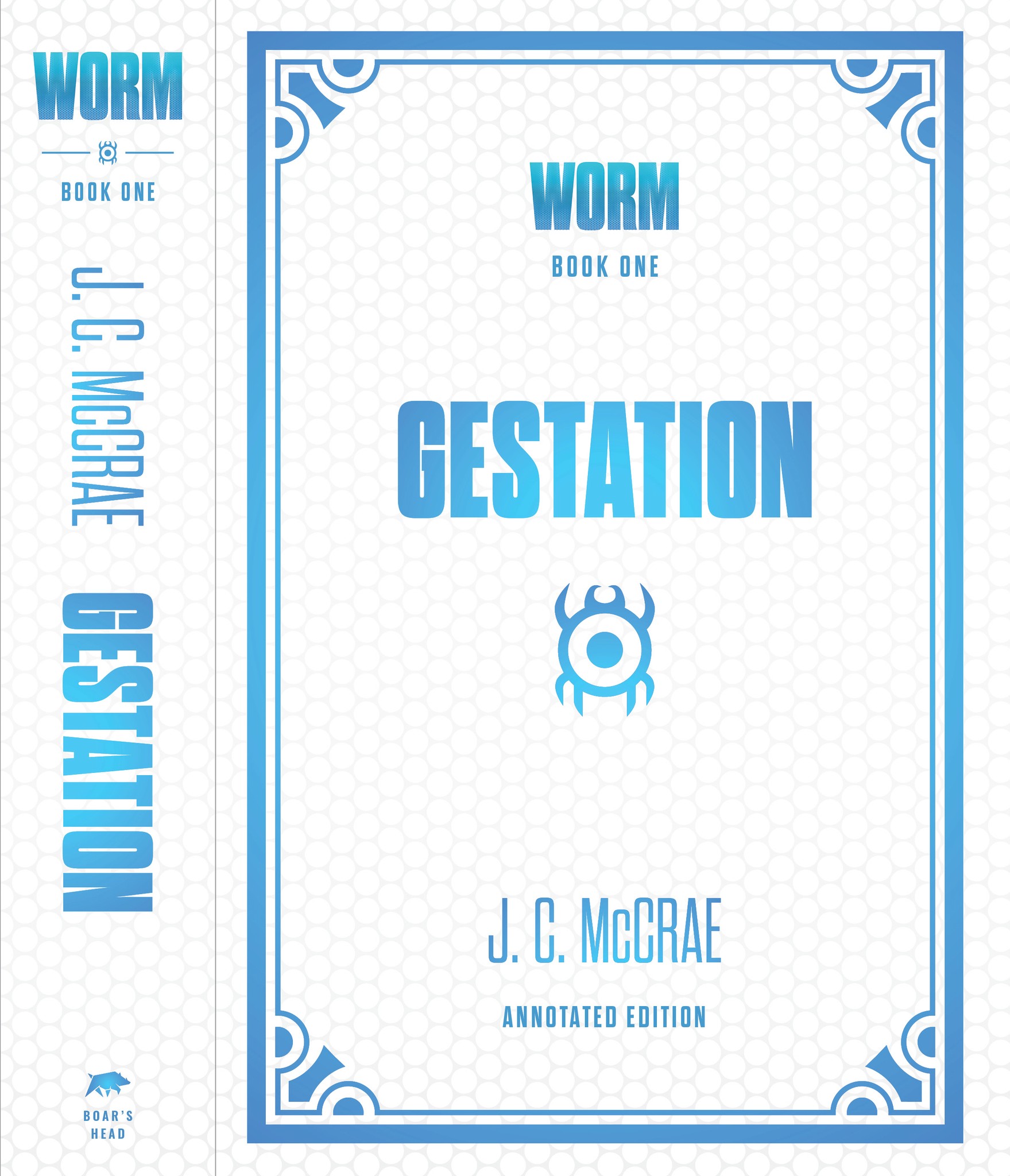
fig. 1
volume one; cover with spine
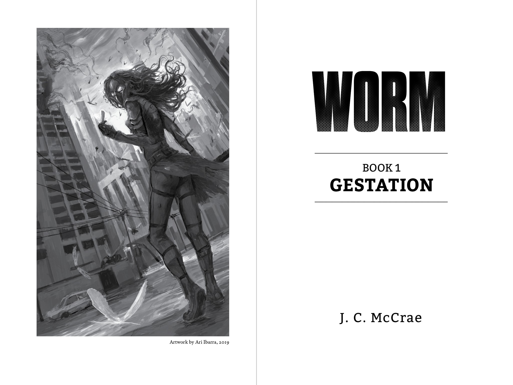
fig. 2
title spread
fig. 3
part spread; image ref. original web banner
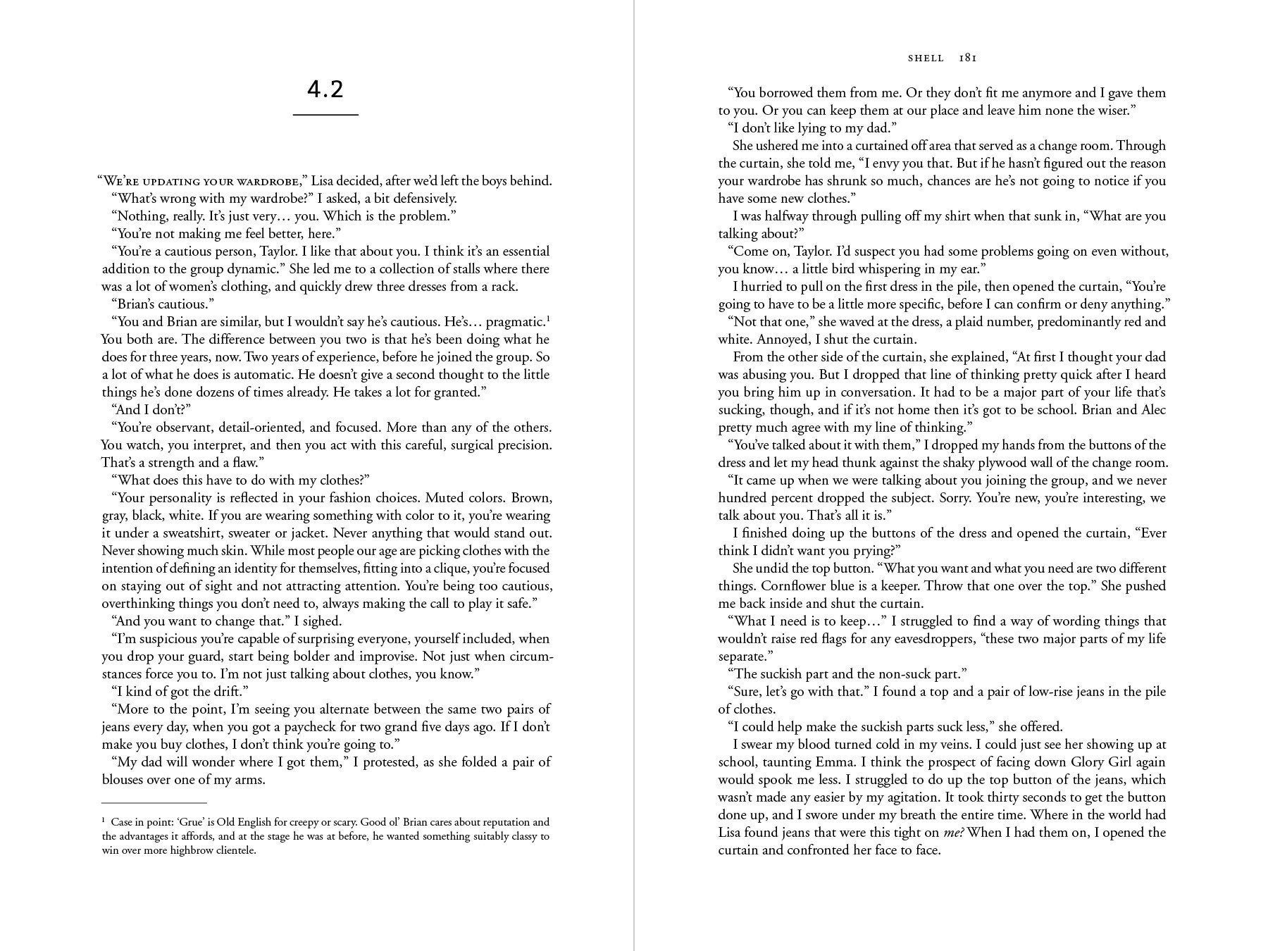
fig. 4
chapter spread; footnote
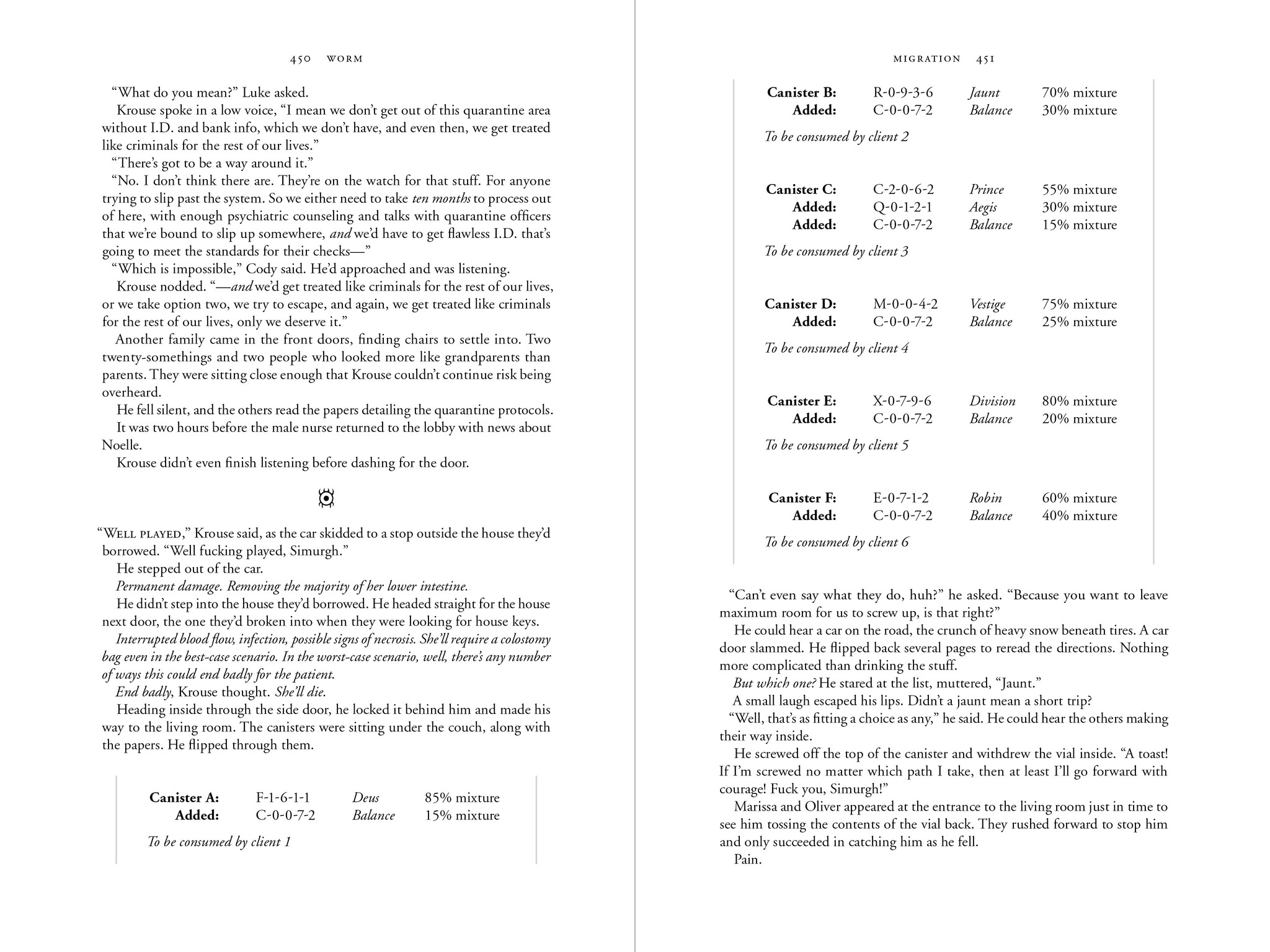
fig. 5
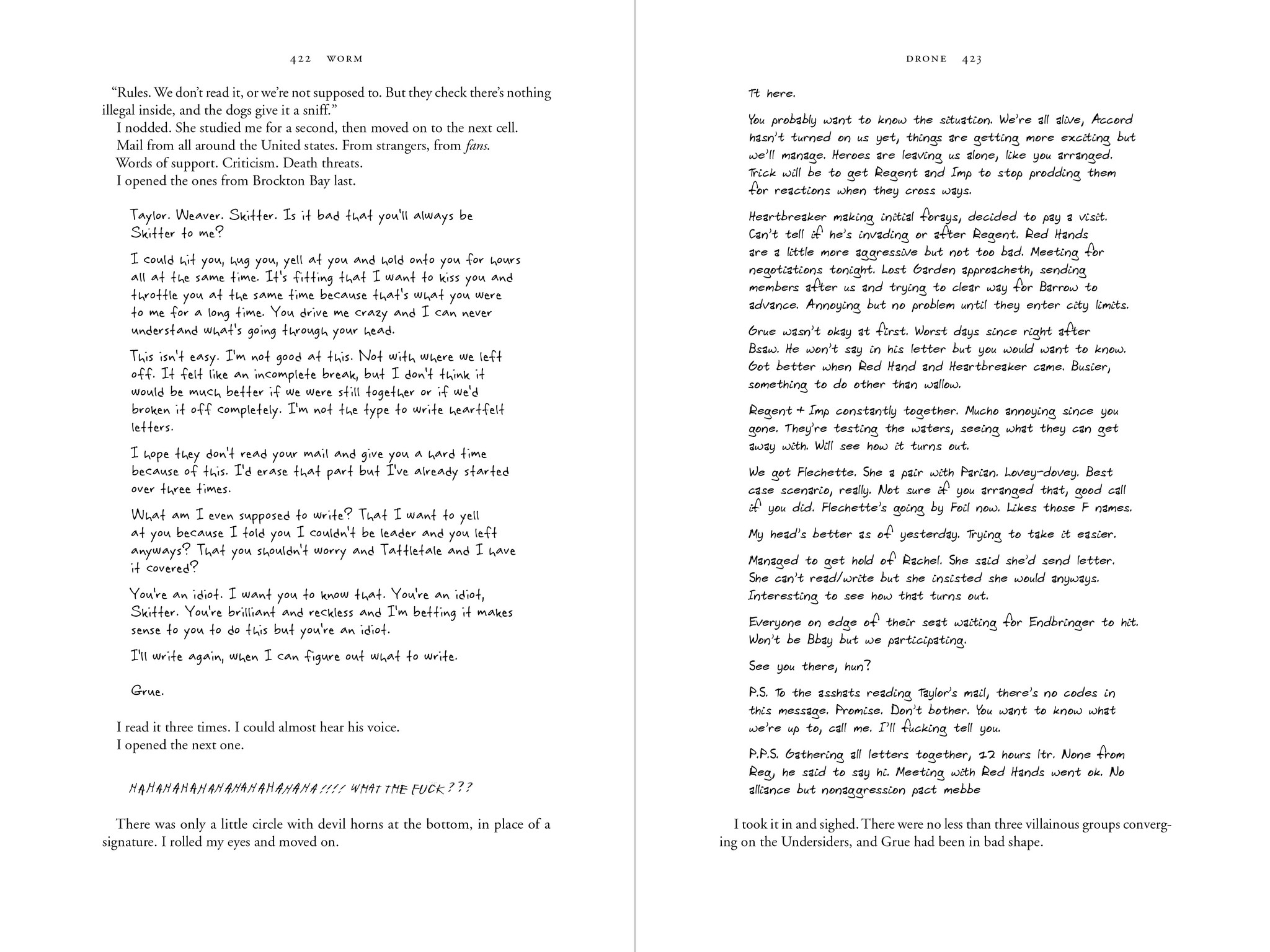
text spread; section break and diegetic insert
fig. 6
text spread; footnotes
fig. 7
text spread; handwriting from multiple characters
ward
by J. C. McCrae
seven volumes
casebound with jacket
one color
6 × 9 in.
1.95 million words
published 2020
gloaming
464 pages
vesper
560 pages
afterglow
800 pages
moonrise
752 pages
dead of night
624 pages
darkest hour
480 pages
aurora
768 pages
about the book
Ward is an epic-length sequel to Worm, released as a web serial in twice-weekly installments between 2017 and 2020. Never since edited or published, I created personal copies for myself as a long-time fan.
The primary challenge was managing the story’s length, with an 800 page-per-volume limit. It consists of 23 arcs, which I divided into seven volumes. I used 10-pt Garamond for the body type, due to its space efficiency. A further challenge was the need to proof the text for typos and inconsistencies.
This adaptation has received significant praise within the fandom, despite never being distributed.
fig. 1
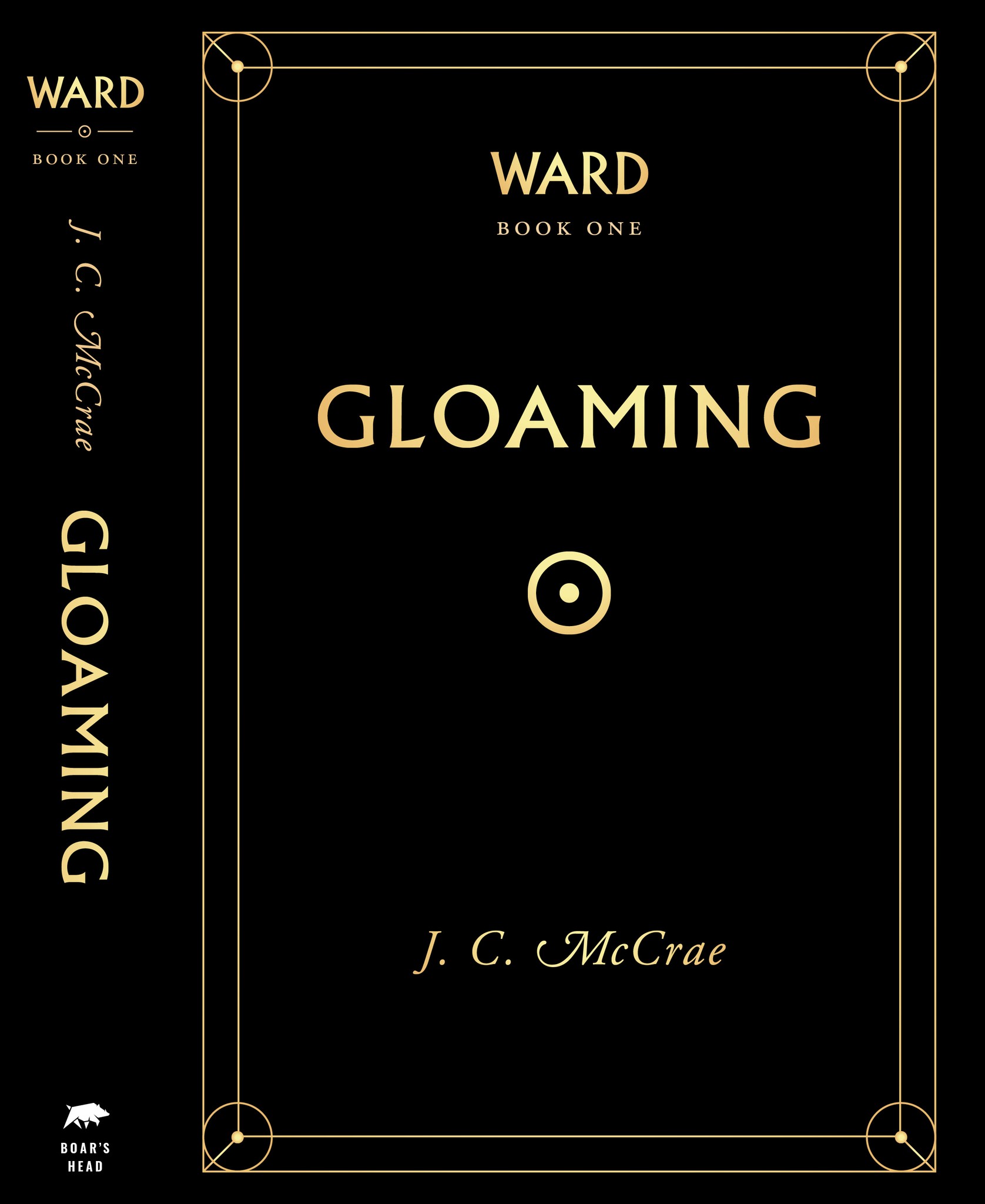
volume one; cover with spine
fig. 2
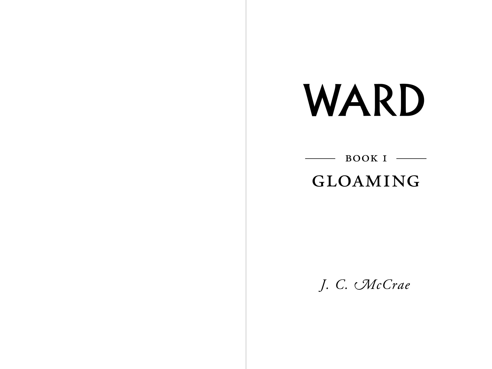
title spread
fig. 3
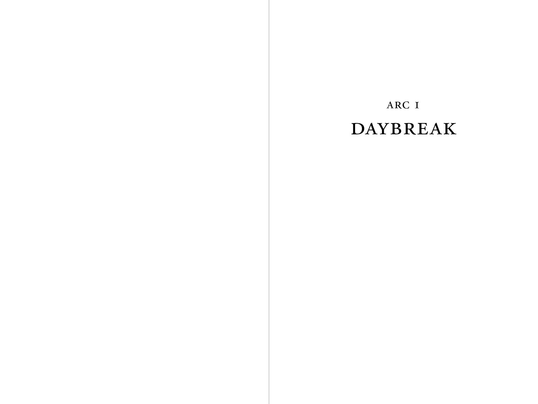
part spread
fig. 4
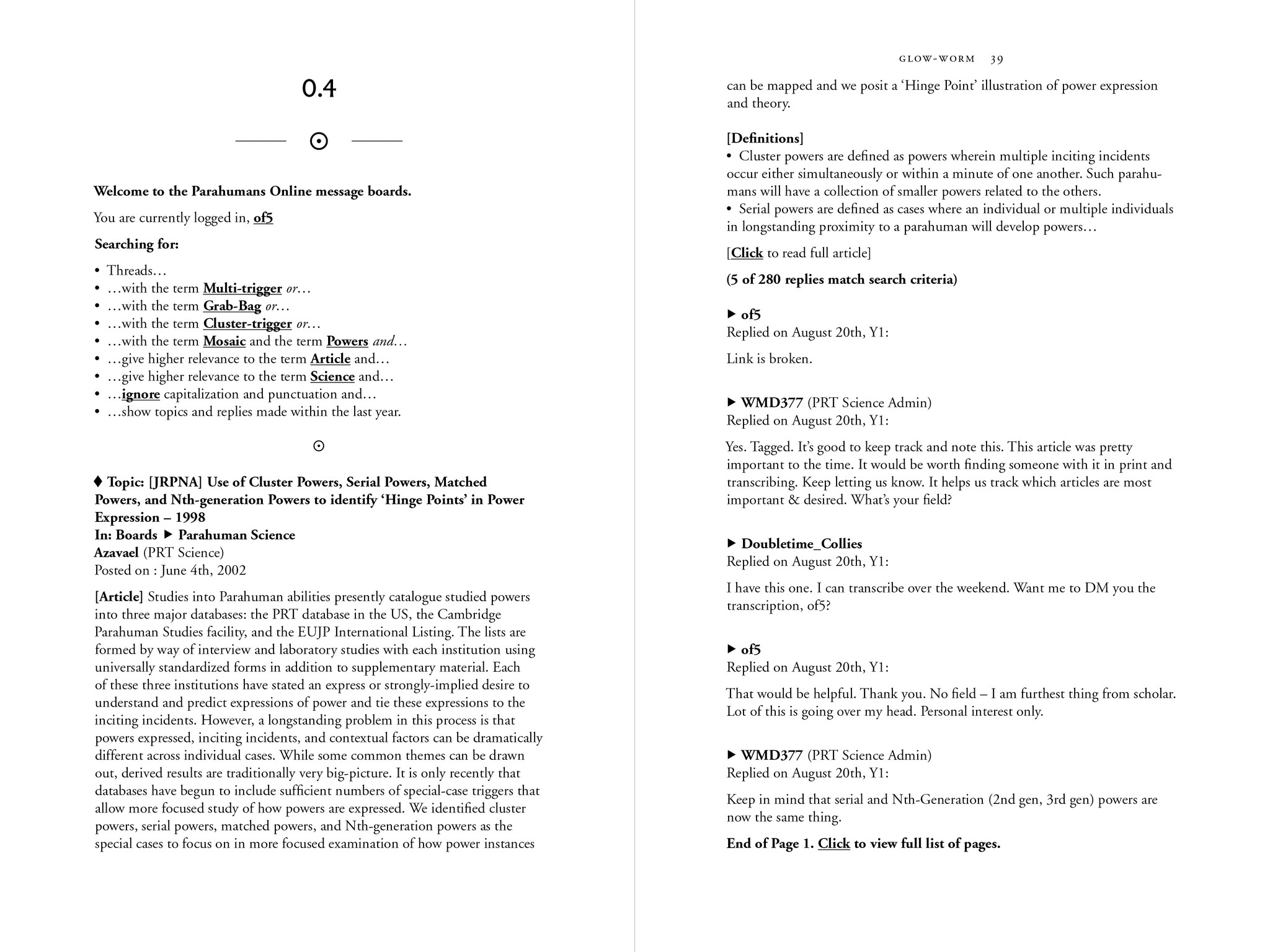
chapter spread; excerpts from an online forum
fig. 5
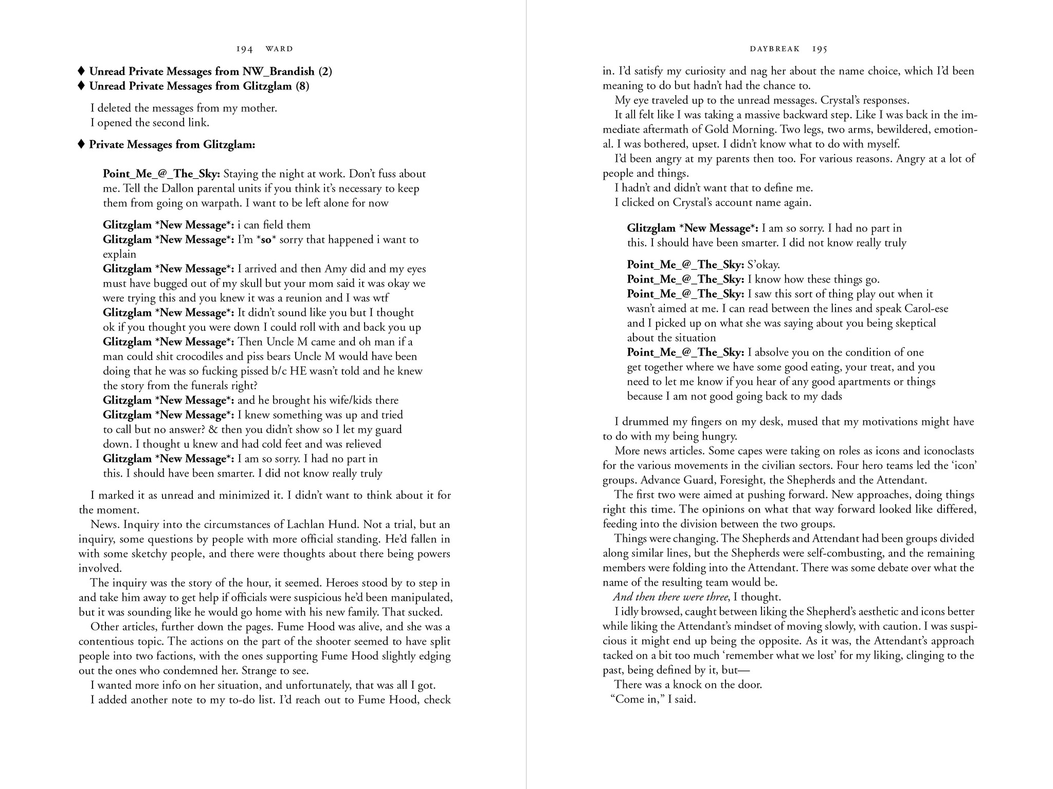
text spread; chatroom excerpts
fig. 6
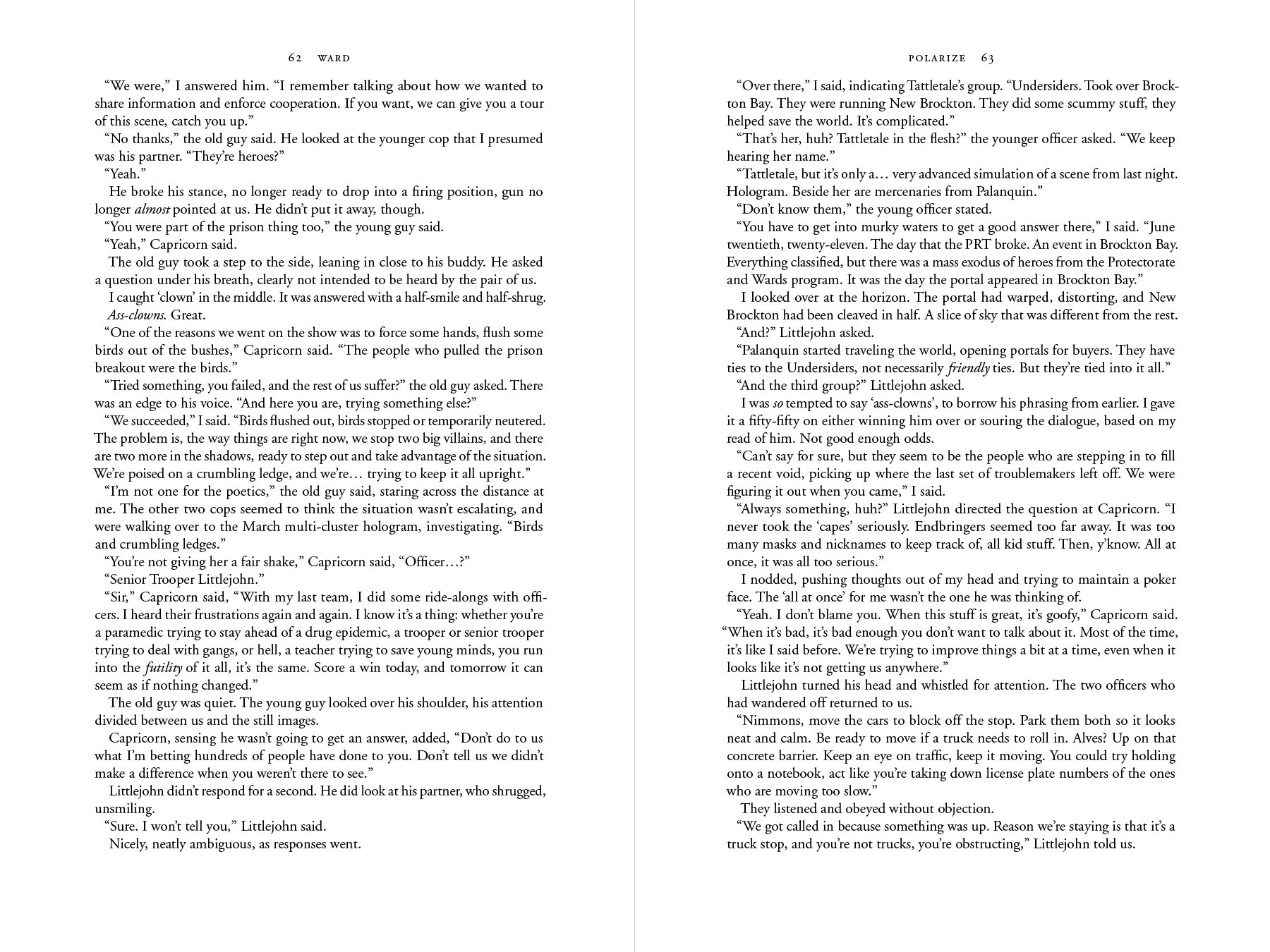
text spread
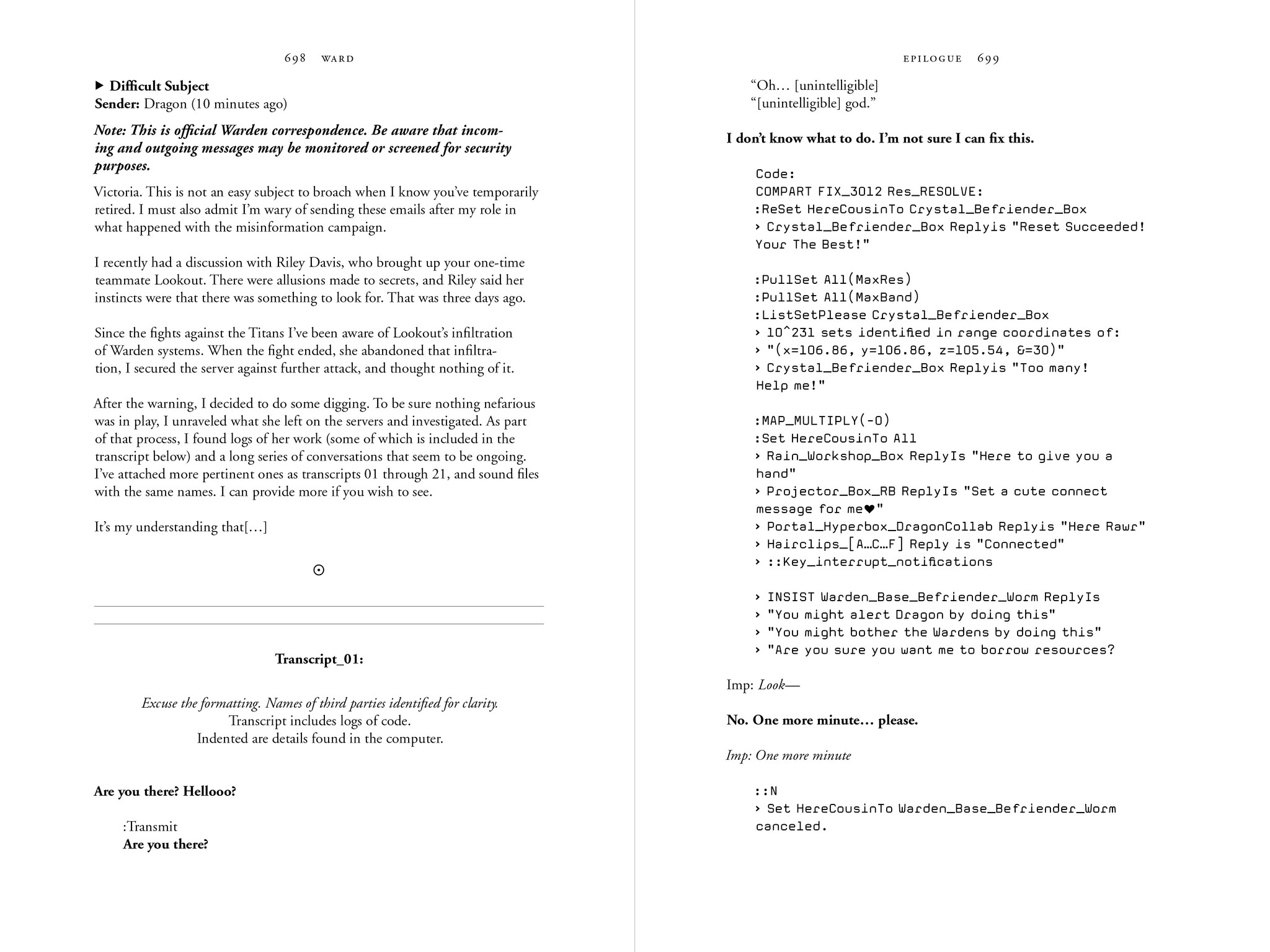
fig. 7
text spread; section break, code snippets, and more
my immortal
by Tara Gilesbie
paperback
two color
5 × 8 in.
128 pages
22,700 words
published 2024
about the book
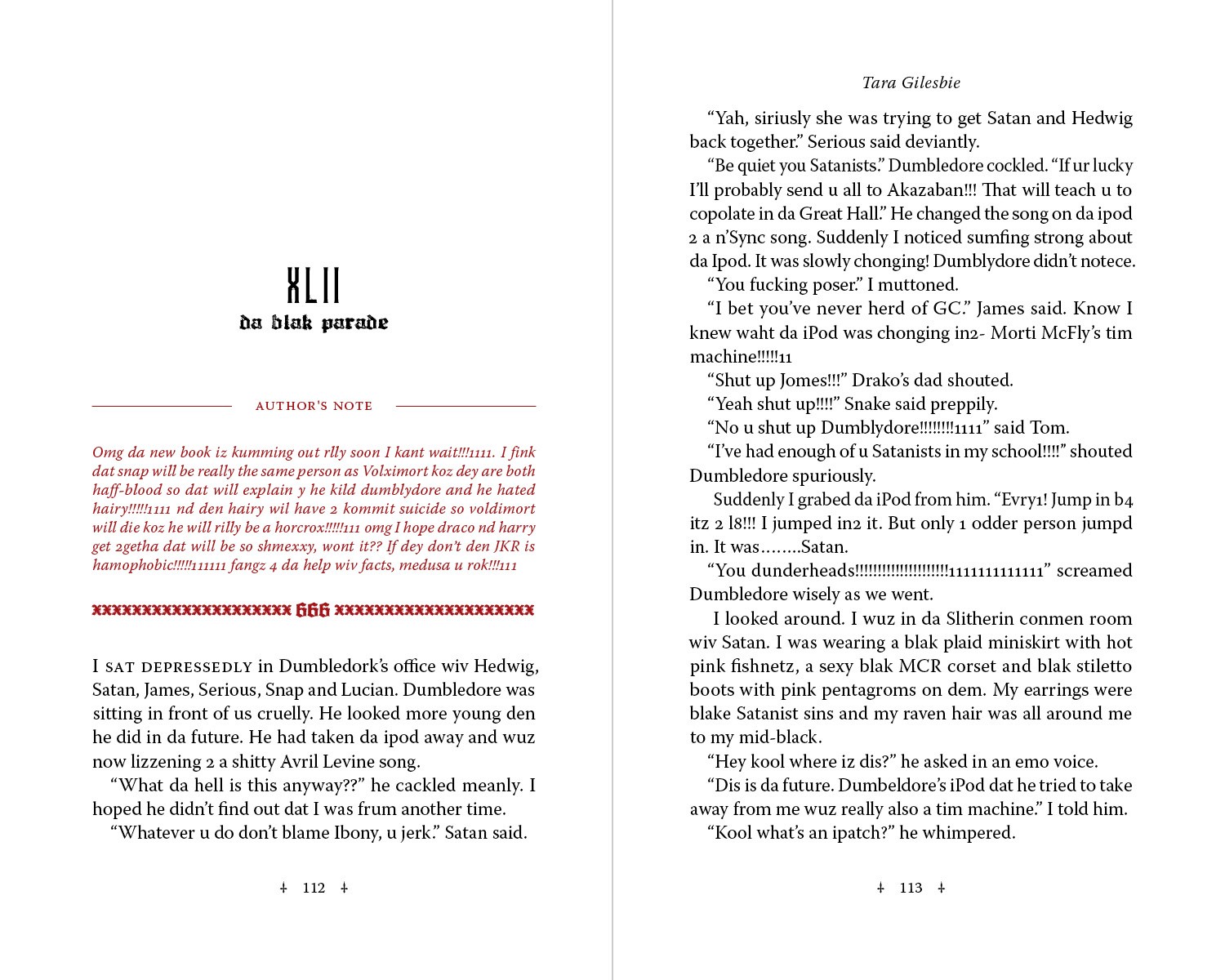
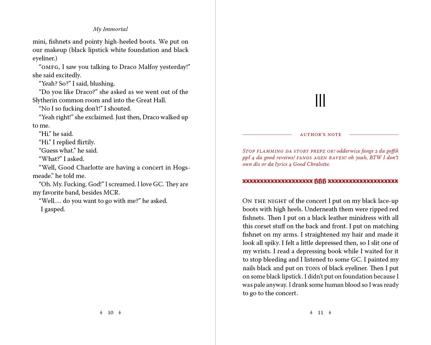
My Immortal is a work of parodic fan fiction that was posted to fanfiction.net during the years of 2006 & 2007. One of the most unintentionally hilarious pieces of writing the internet has ever produced, it has never been determined whether or not it is a work of satire, and the author's identity is considered impossible to verify.
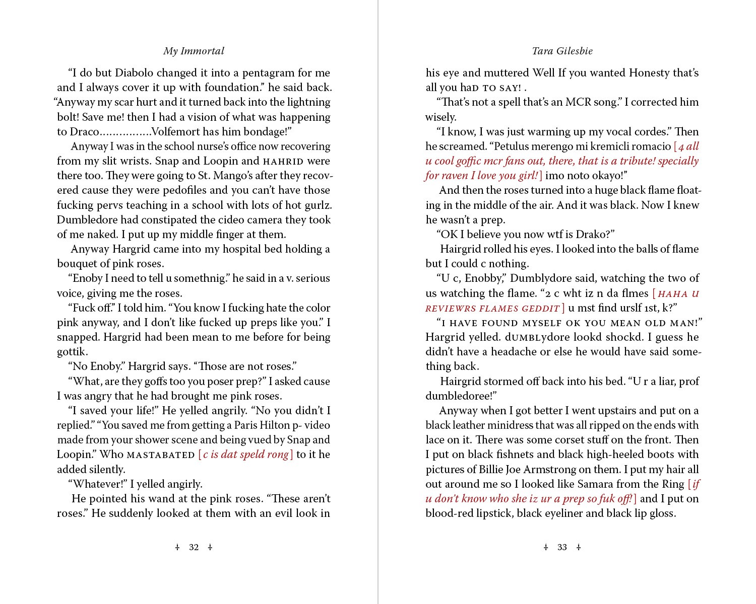
The primary challenge came from taking a text formatted for online viewing and littered with inconsistencies, asides, and 'leet speak,' and balance the preservation of its quirks against the needs of a traditional, readable book. It required a light but considered touch and an intimate familiarity with the text.
I designed the text and its interspersed author's notes in two colors, at novella size. To set off the chasm between the story's ambitions and its reality, I dressed the type in a style evoking a gothic Victorian classic, using the sharp-edged Warnock Pro.
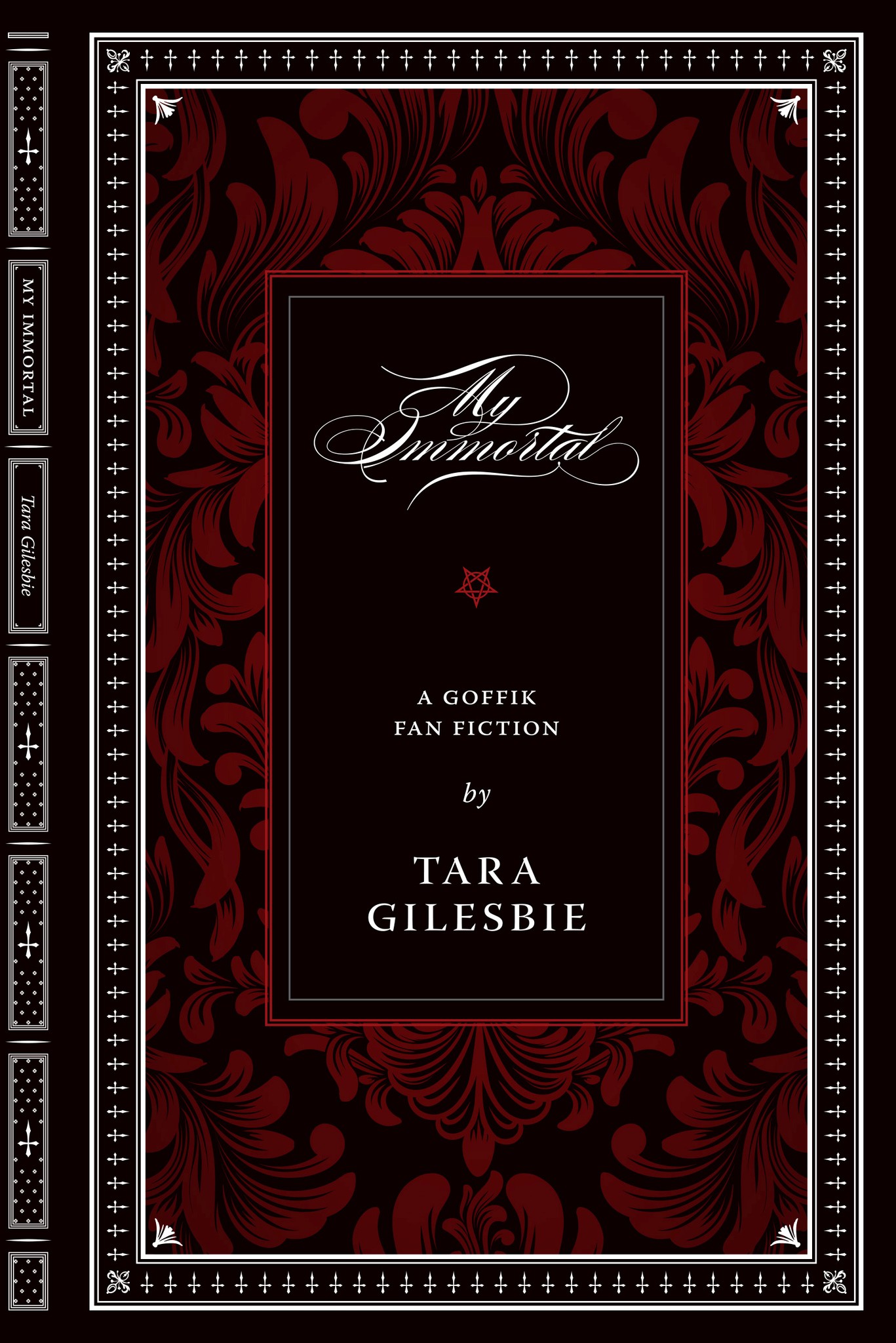
fig. 1
cover with spine
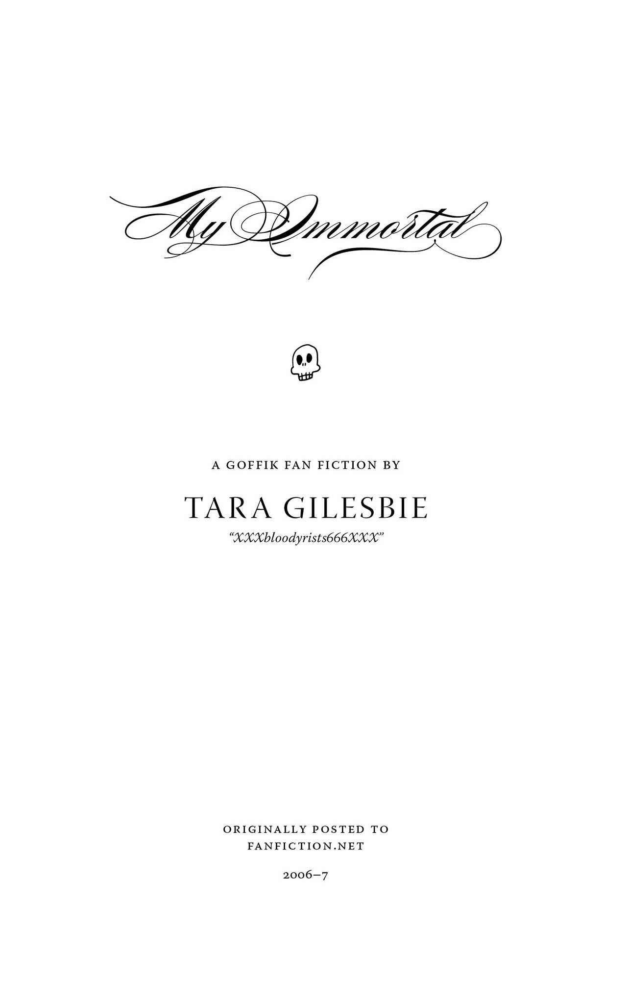
fig. 2
title page
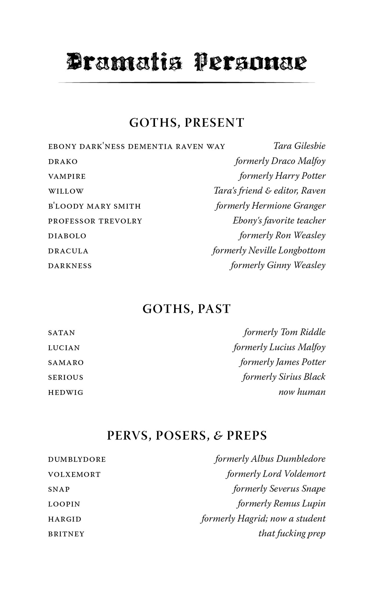
fig. 3
dramatis personae
fig. 4
chapter spread; with title
fig. 5
chapter spread; no title
fig. 6
text spread
fig. 7
text spread; special element
astro curriculum
by Room 228 and Claude Jones
paperback
full color
8.5 × 11 in.
72 pages
published 2024
about the book
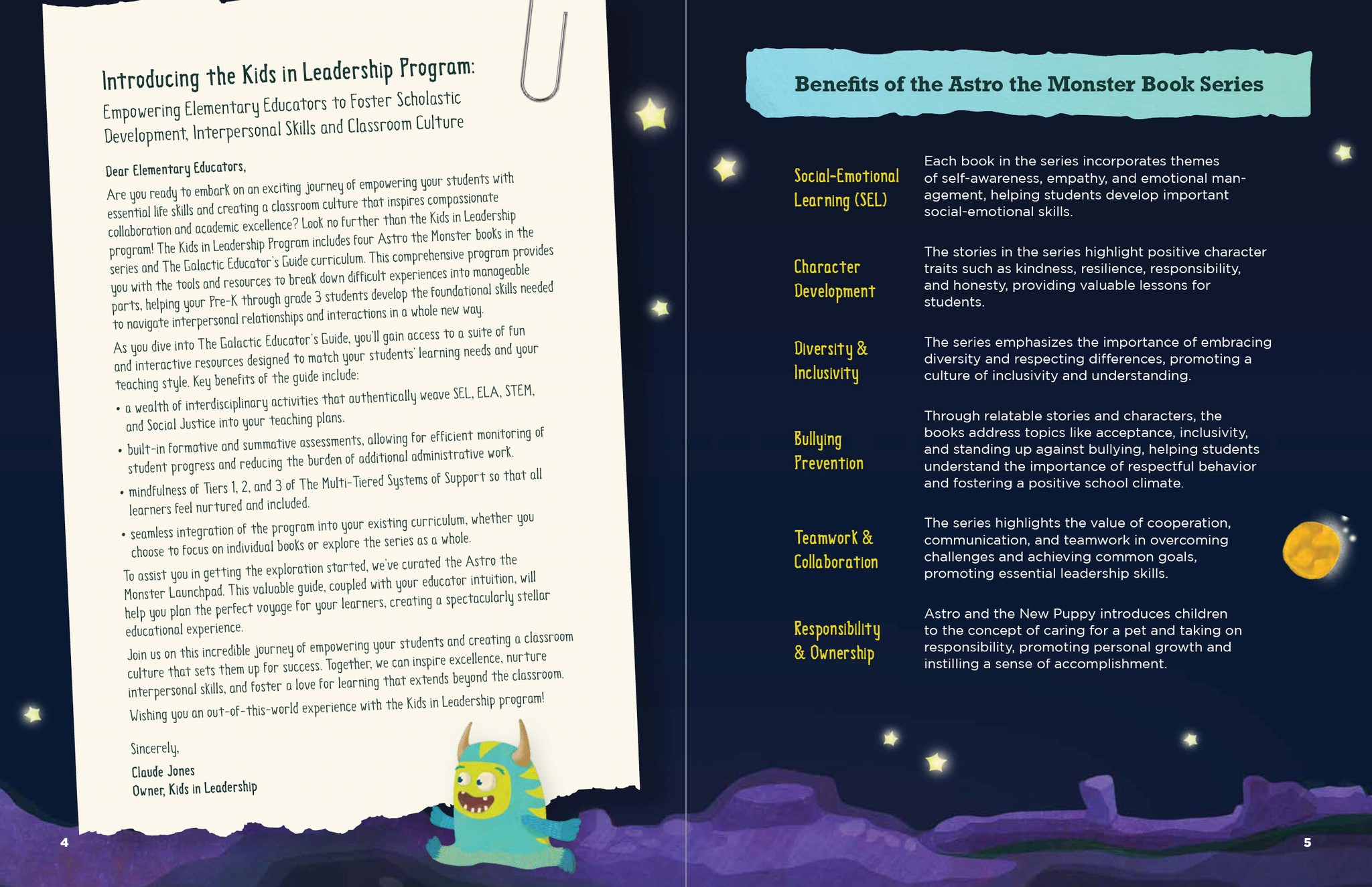
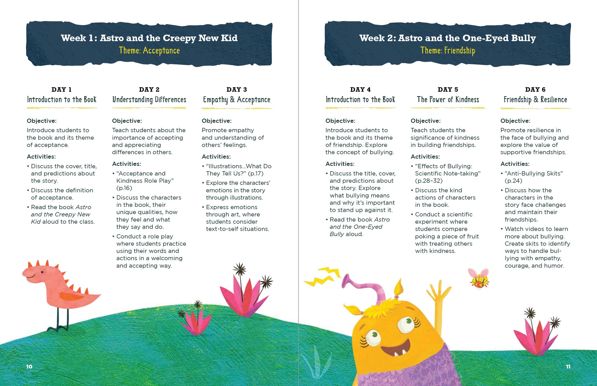
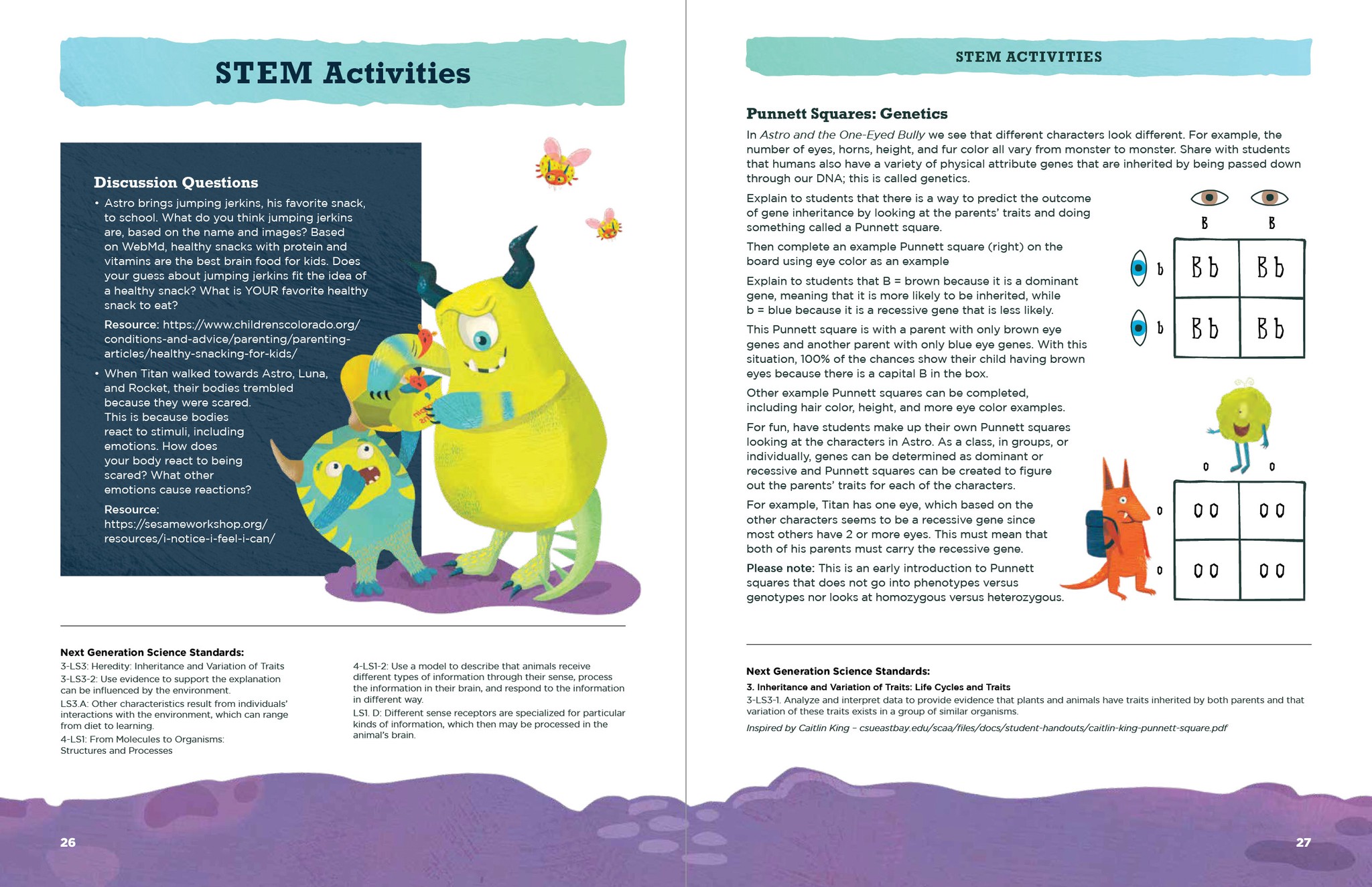
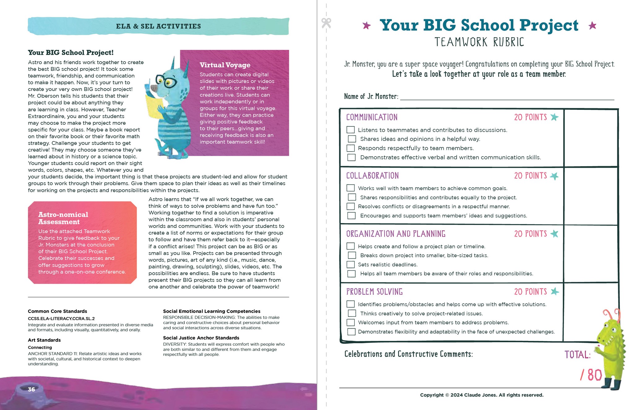
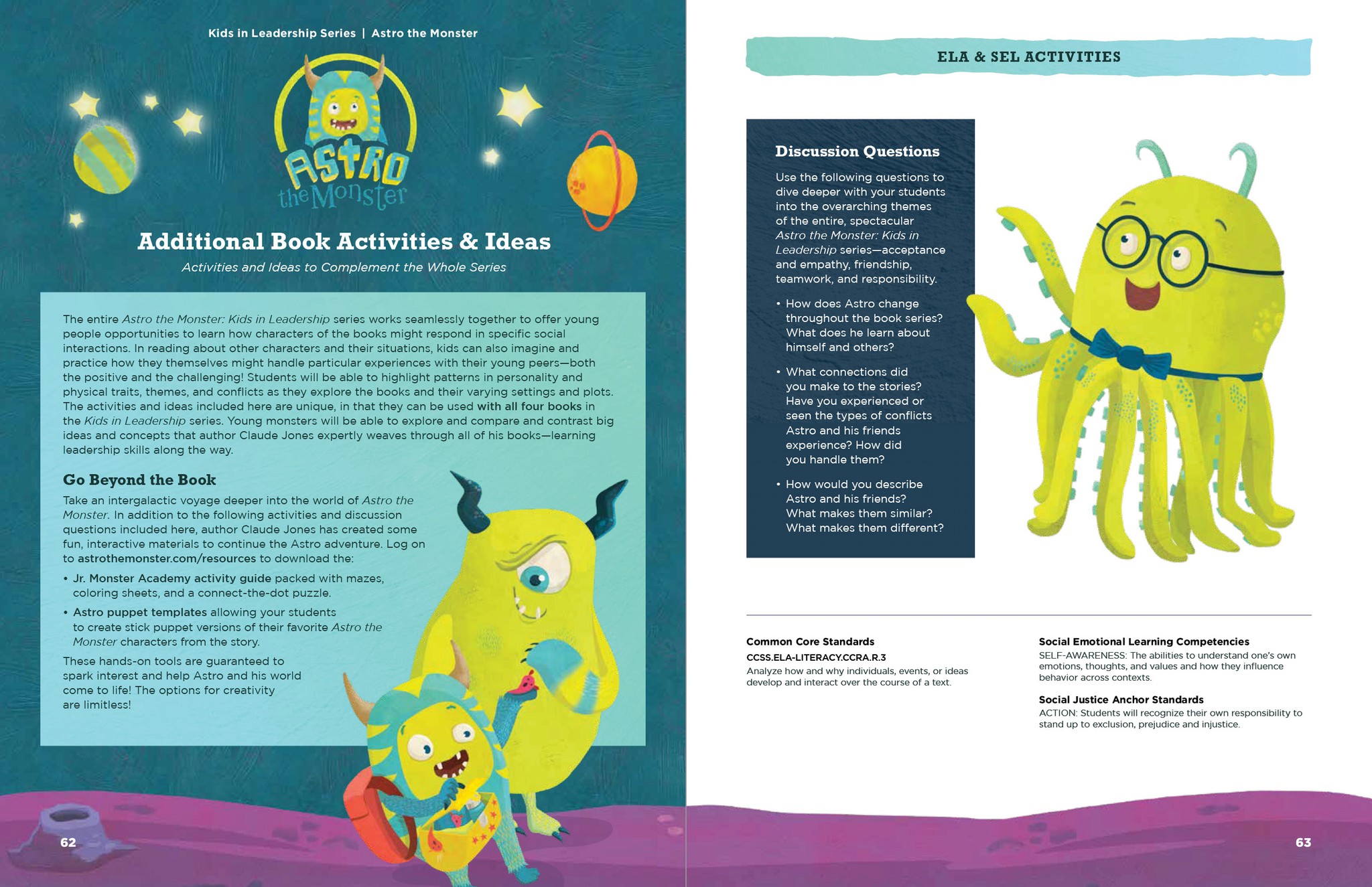
Astro the Monster is a series of early reader books written by Claude Jones and illustrated by Laura Watson. Room 228 was commissioned to create a curriculum to accompany the series in classrooms, with myself as designer.
This project coalesced in fits and starts over several years. Initially, it was designed as a trio of packets, one for each book, but as the content developed, the author decided to merge everything into The Galactic Educator’s Guide.
The challenge was four-fold: (1) unify the existing packets, (2) expand the content to include front matter, a fourth book, and new lesson plans for the full series, (3) revise the graphics to match the newly created website, and (4) reformat the content as a booklet for Amazon KDP.
fig. 1
cover spread
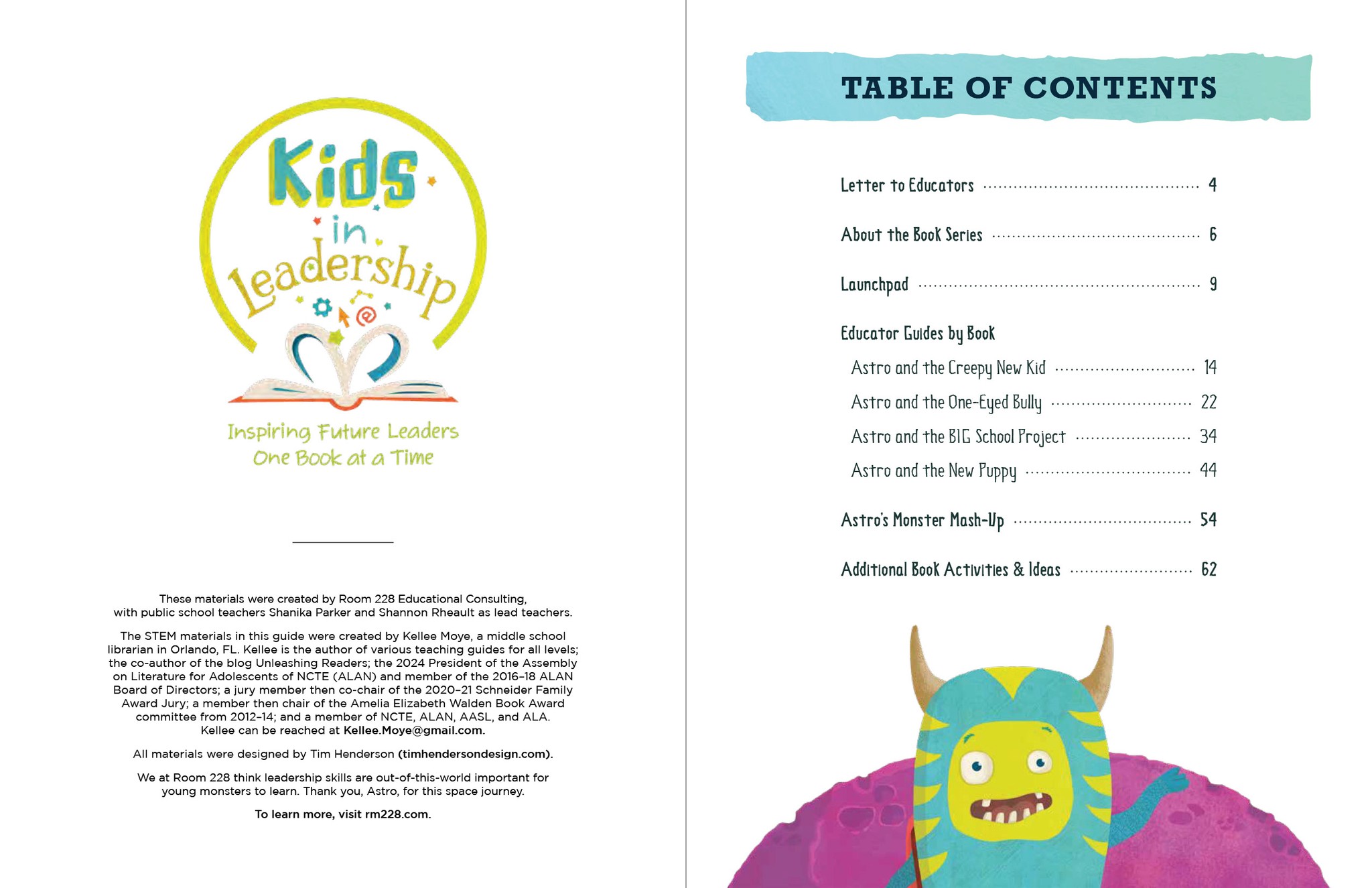
fig. 2
table of contents
fig. 3
introduction and educational pillars
fig. 4
lesson planning by day
fig. 5
activities and diagrams for book two
fig. 6
activities and rubric for book three
fig. 7
additional activities
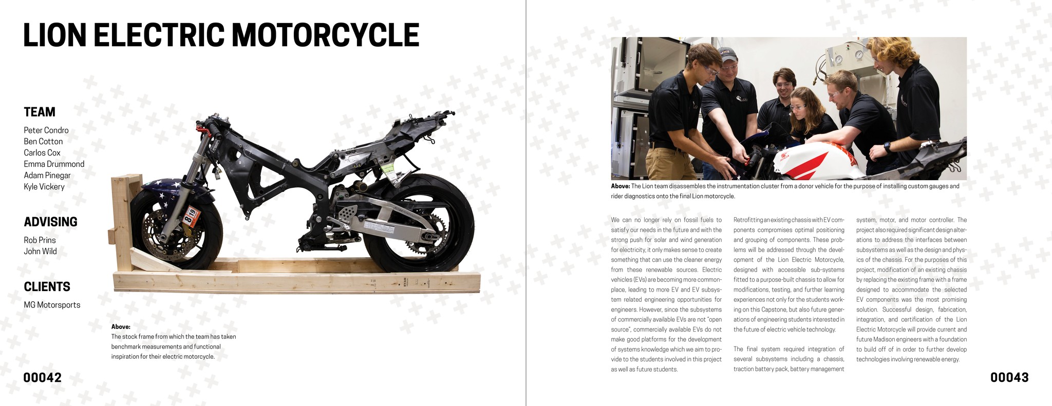
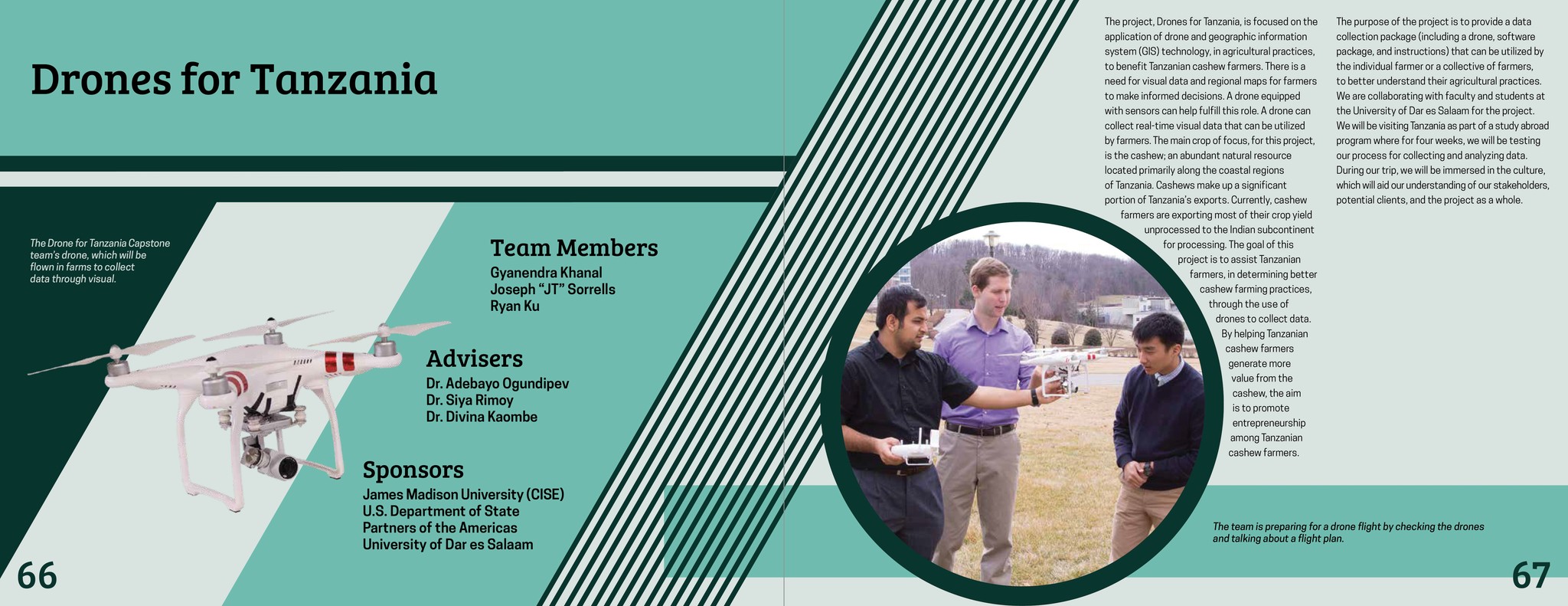
xchange 2019
by the JMU College of Engineering
perfect-bound paperback; spot gloss
full color
11 × 8.5 in.
100 pages
published 2019
about the book
The James Madison University xChange program is an annual event showcasing the capstone projects of the engineering students. It’s visual identity is unique each year; in 2019, the college president requested it be inspired by the The Beatles ‘White Album.’
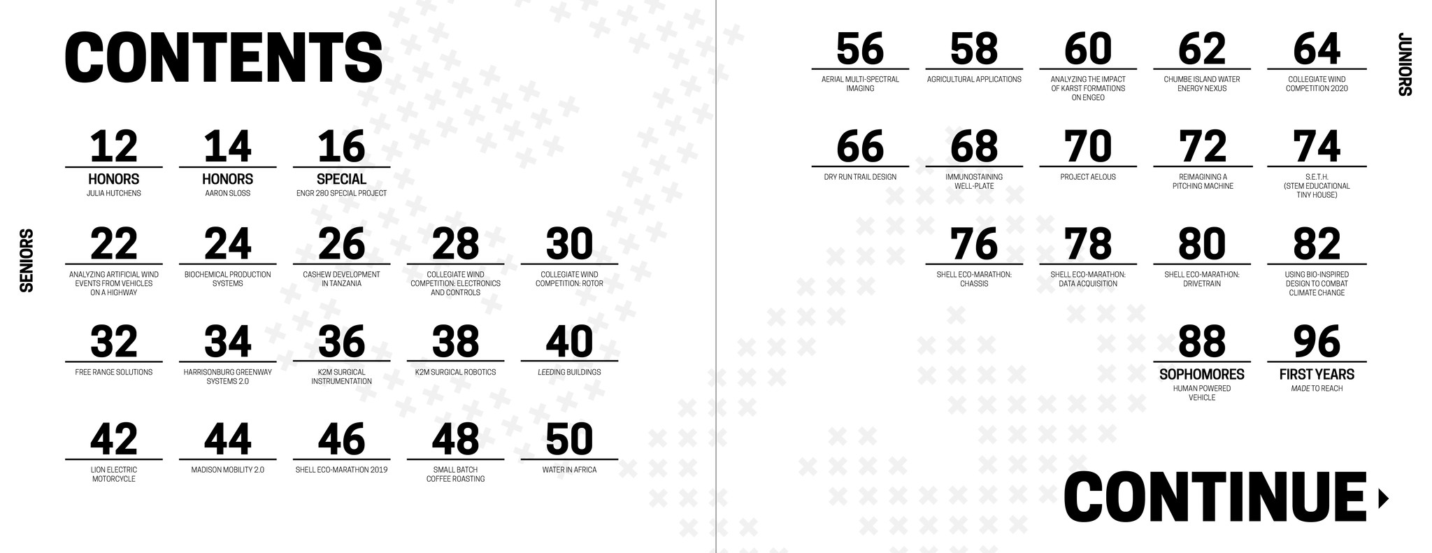
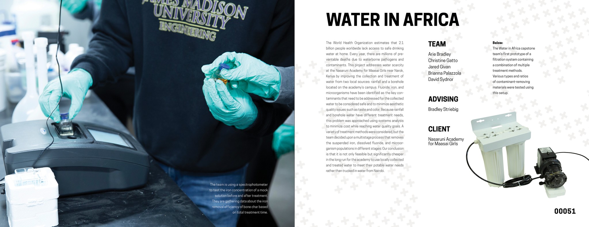
The book consists of 34 projects spread across five sections, plus front matter and a gallery. To prevent monotony in the design while employing such a spare aesthetic, a modular layout was introduced to the project pages for the first time (contrary to the one-size-fits-all approach of previous years). This also allowed optimized layouts for individual projects, which could vary heavily in their content.
Retrospective: While a significant improvement over the previous year's effort, my typesetting skills were still developing. The text would have benefitted from increased H&J attention, tighter leading, and indentations.
fig. 1
cover with spine
fig. 2
program pillars
fig. 3
table of contents
fig. 4
section divider
fig. 5
project spread 1
fig. 6
project spread 2
fig. 7
project spread 3
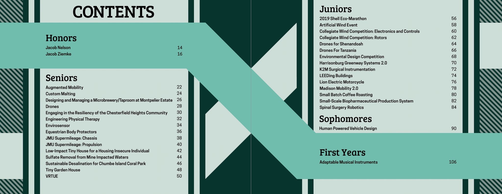
xchange 2018
by the JMU College of Engineering
perfect-bound paperback
full color
11 × 8.5 in.
116 pages
published 2018
about the book
The James Madison University xChange program is an annual event showcasing the capstone projects of the engineering students. It’s visual identity is unique each year; in 2018, it was designed with an abstract geometry inspired by constructivist style, emphasizing the industrial and urban development focus of the engineering projects.
The book consists of 34 projects spread across five sections, plus front matter and a gallery. Each spread featured a clipped-out image of the student project alongside additional photos and information on templatized layouts inspired by the cover.
Retrospective: One of my earliest efforts in book design, this represented a significant accomplishment. Nonetheless, it is very evidently a student's work. It's gratifying to see how far I've come.
fig. 1
cover with spine
fig. 2
program pillars
fig. 3
table of contents
fig. 4
section divider 1
fig. 5
section divider 2
fig. 6
project spread 1
fig. 7
project spread 2
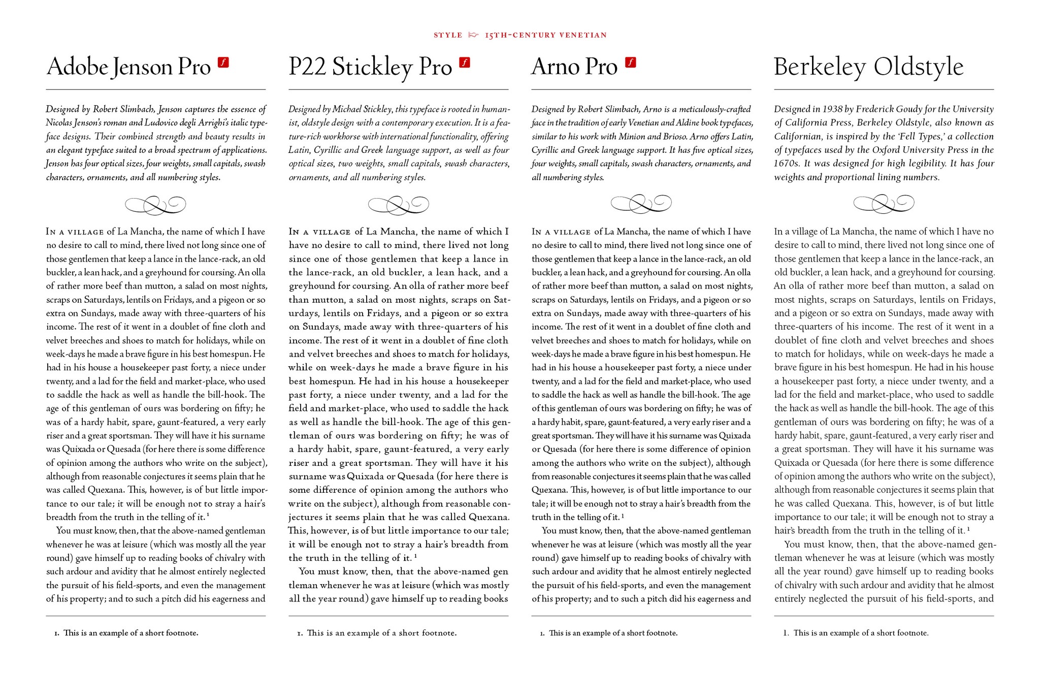
specimen sheets
by Tim Henderson
two color
17 × 11 in.
7 pages
2024
about the study
In order to grow my understanding of the typesetting tools available to me and speed my decision-making, I decided to create printed specimen sheets for some notable book faces.
I explored 26 robust and well-regarded families, categorized them loosely by style and era, and wrote a short description for each, including their available weights, optical sizes, and OpenType features. I displayed text at title, body, and caption sizes, and featured samples of italics and small caps. The body text was a selection from Don Quixote set at 12/16. Ornament sets were also featured for quick reference.
I learned a great deal from this process, and now have an excellent tool I can use to quickly identify the typeface that is the best fit for a given book, ensuring it has all necessary features to support the content. I also intend to re-set these specimens with 10pt body type.
In an ideal world, I would replace the weaker faces with other notables I do not currently own, such as Centaur, Galliard, Van Dijck, Fleischmann, Monticello, and Walbaum.
fig. 1
15th-century venetian style faces
incomplete works, 2024
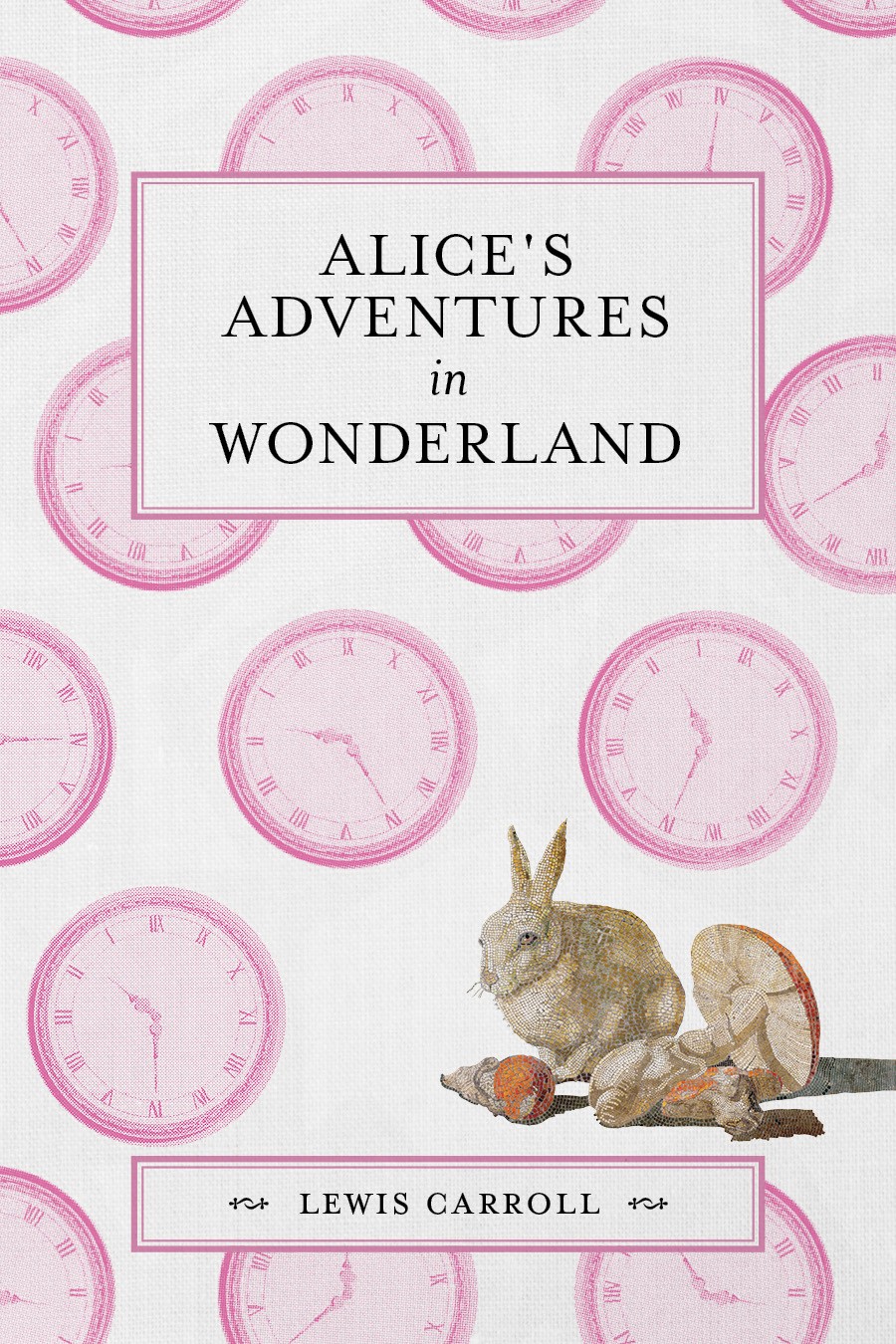
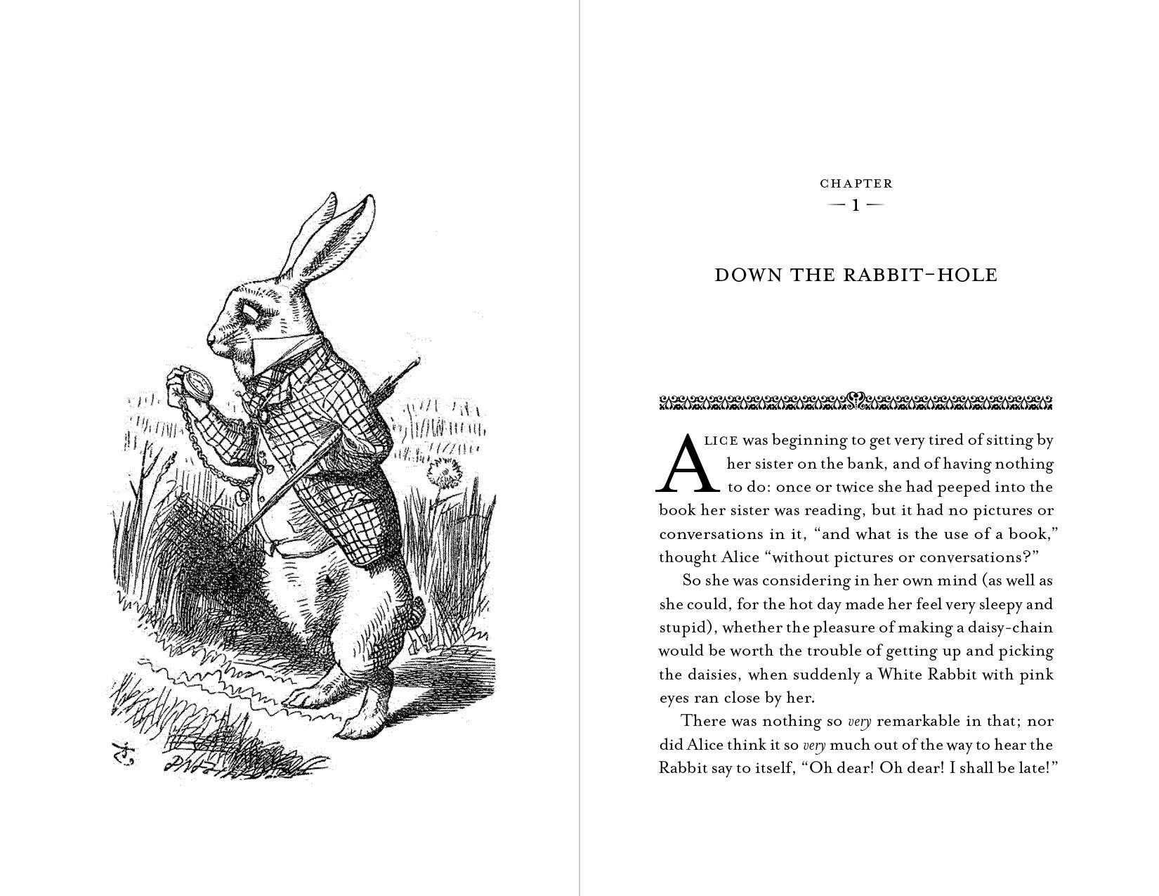
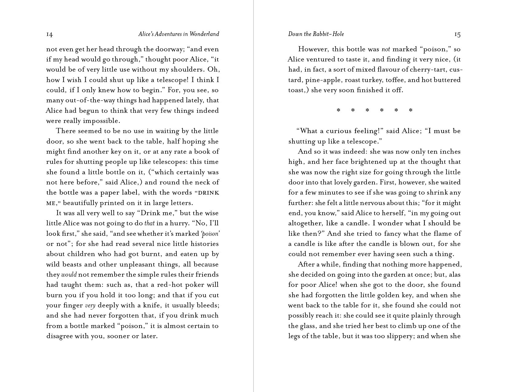
Initial spreads from two works-in-progress. Text and art sourced from Project Gutenberg and The Met's open access library.
Alice's Adventures in Wonderland is formatted at 5.5 × 8.5 inches. Often, Baskerville may be used for 19th-century British texts like Alice. In a playful twist, I chose to set my version with the typeface Mrs. Eaves, connecting its origin as a distorted, 'through the looking glass' counterpart to Baskerville with the content and themes of the story.
Don Quixote is formatted at 6 × 9 inches. In order to complement the story's content, themes, and age (it is often considered to be the first modern novel), I set the type using Brioso, a whimsical face of calligraphic origins that brought a wonderful motion and energy to the page while retaining an antiquarian sensibility.
fig. 1
cover; alice's adventures in wonderland
fig. 2
chapter spread; alice's adventures in wonderland
fig. 3
text spread; alice's adventures in wonderland
fig. 4
chapter spread; don quixote
fig. 5
text spread; don quixote

